UX/UI Design/ Website Design/ Branding
Arranged : A Dating App
85% +ve response from 50+ young adults to ground research- Mobile app design | Website Design | Brand Identity Design (Logo, Design Style, Color Palette and Illustrations)
Year :
2025
Industry :
Social Networking and Discovery
Client :
Riddhish Patel
Project Duration :
4 months

Branding & Logo
The logo’s geometric heart—formed by interlocking paths and angular lines—visually represents intentional connection. It’s not a scattered swipe; it’s a guided route/journey toward something real.. The stylised fusion of “A” and “R” within the heart subtly nods to the brand name Arranged, reinforcing the idea of structured intimacy.
Lines and paths: Symbolise curated matches and the thoughtful routes users take toward real-world connections.
Symmetry and geometry: It’s not chaotic or random like traditional swipe culture; it’s structured, thoughtful, has clarity and emotionally intelligent.
Heart shape: Grounds the brand in warmth and romance, but with a modern, minimalist twist.
Color | Emotion & Functionality |
|---|---|
| Sophisticated, trustworthy, and emotionally rich. It evokes depth and intimacy—perfect for a dating app that values real-world chemistry over superficial swiping. |
| Gentle, calming, and inclusive. It softens the boldness of plum, adding a layer of approachability and emotional safety—ideal for onboarding and profile flows. |
Together, these colors create a premium yet inviting tone, balancing elegance with emotional warmth. They signal that Arranged is not just another dating app—it’s a space for intentional, meaningful connection.
"Stop Swiping. Start Dating.”
The tagline is a direct challenge to the fatigue of modern dating. The logo and colors reinforce this shift:
The structured heart says: “We’ve done the work. You just show up.”
The deep plum says: “This is serious, but not heavy.”
The soft lavender says: “You’re safe to be yourself.”
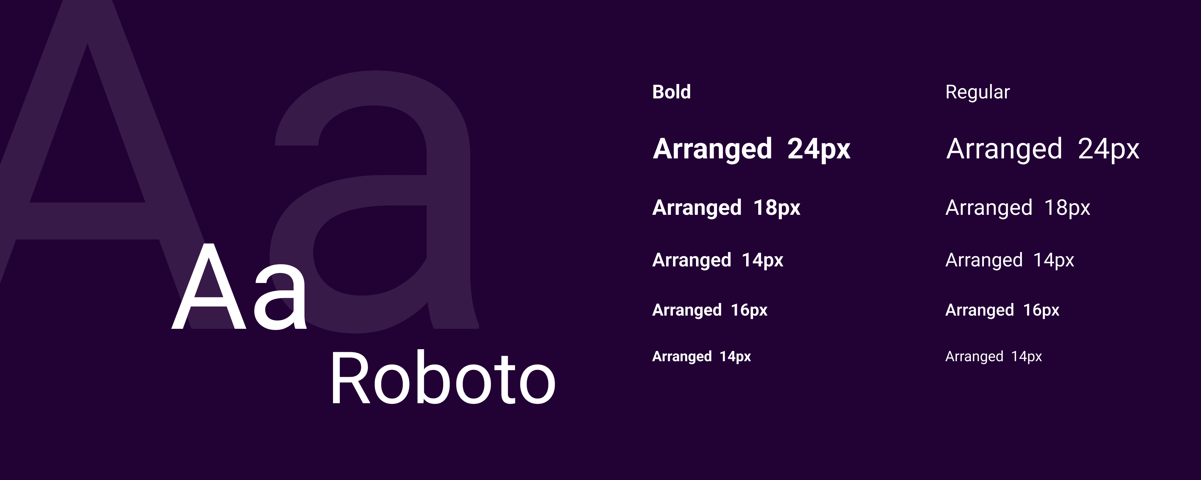
Together, these colors create a premium yet inviting tone, balancing elegance with emotional warmth. They signal that Arranged is not just another dating app—it’s a space for intentional, meaningful connection.Font: Roboto (Simple and classic)
It’s not about endless options—it’s about limited, curated profiles that match your preferences, and real dates at trusted restaurants. The branding reflects this clarity: no noise, no loops, just intentional design for intentional dating.

Visual Identity
The illustrations you've curated for Arranged are clean, modern vector visuals that speak the language of emotional clarity and digital intimacy. They use soft gradients, rounded shapes, and minimal line work to evoke a sense of warmth, trust, and approachability—qualities essential for a dating app that prioritises real-world connection.
These are flat-style, semi-isometric vectors with a slightly playful but mature tone. The use of symbolic metaphors—like the hourglass for time, the networked profiles for curated discovery, and the romantic dinner scene for offline chemistry—makes the visuals feel purposeful and story-driven. Each illustration is not just decorative; it reinforces a key brand message: Arranged is about thoughtful design, emotional nuance, and intentional dating.
This style is especially appropriate for the app because it balances tech-forward sophistication with human-centred warmth. It appeals to Gen Z and millennial users who value aesthetics but crave authenticity. The illustrations help visually narrate the user journey—from profile curation to date planning—while maintaining a cohesive brand tone that’s elegant, emotionally intelligent, and refreshingly real.

The application
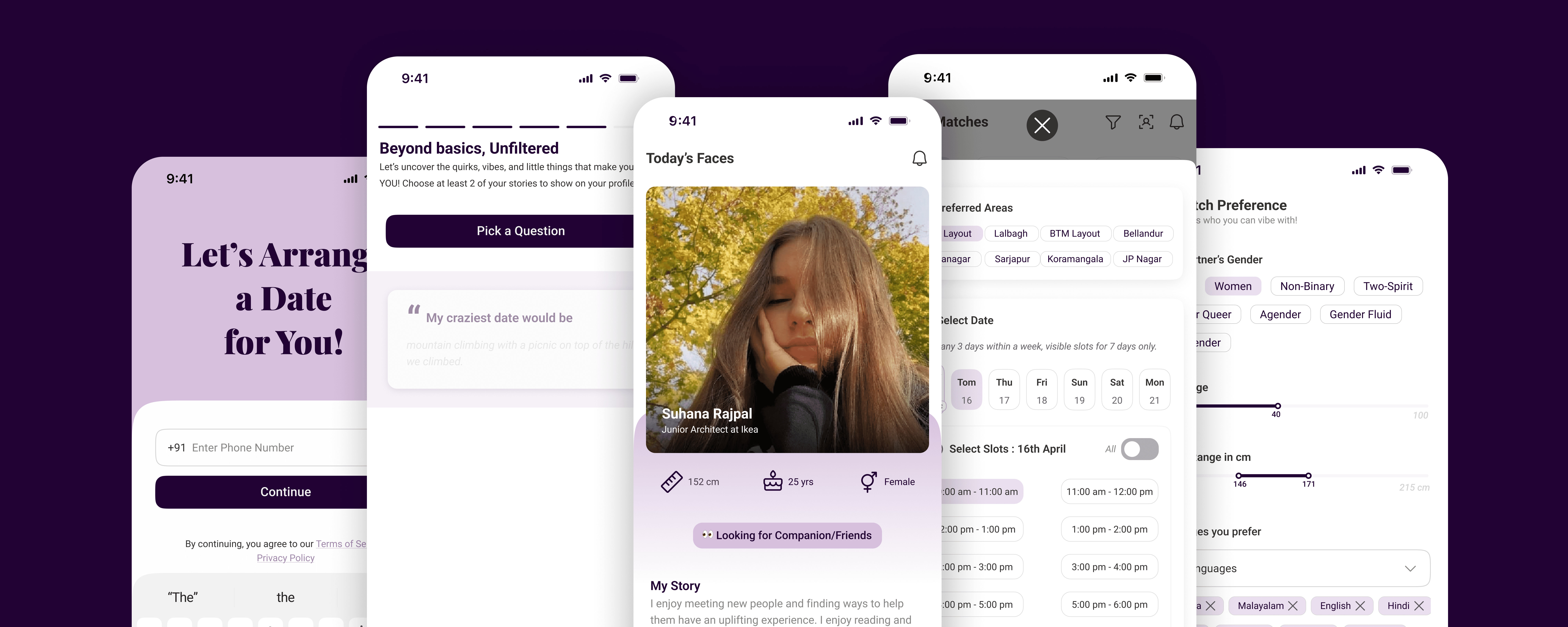
The app focuses on scheduling a Date or a hangout for the two individuals.
Seamless onboarding includes details about the person signing up, where the verification of the person is manadatory for the authentication of the app and its users.
User gets Limited profiles without endlessly swiping, but making the user go through the 5-10 profiles delivered a day (within 24 hrs) because each person matters, and we cannot decide to hang out with people on the basis of a first 3-second glance. The idea is to break the monotony of current behaviour of dating applications.
Scheduling, rescheduling, cancelling and confirming is the choice given to the users, but to avoid unplanned reschedules and cancellations, the user has to provide a reason to the other person, and more than 3 cancellations will temporarily inactivate your profile.
To avoid any miscommunication, the app has a chat window 3 hrs before the date and also the directions for the restaurant where the date is scheduled.
User can also set their preferences in the account section for their life partner or friend with respect to height, age, lifestyle, love language, etc., to avoid random profile suggestions.
Designed only to confirm and pay with a basic amount or Dates/Hangouts without waiting for days.
Web Design
The website design is more minimal towards narrating the value of the brand and how it is different from the current dating apps in the market by conveying how it works. Since its a new launch, it mostly focuses on delivering the focus to places launched and why users should join early. Simple and direct to the users without creating a lot of chaos, instead bringing up the USP in a more subtle and clear way, making it crisp for the users to stay engaged to the understanding about Arranged.
By showing limited, curated profiles each day and helping users schedule real dates at trusted restaurants, Arranged flips the script on modern dating—making it feel intentional, intuitive, and beautifully human. The branding doesn’t just look elegant—it feels like clarity in a noisy world.
Website (Live) : Click below
Arranged - Stop Swiping, Start Dating
More Projects


UX/UI Design/ Website Design/ Branding
Arranged : A Dating App
85% +ve response from 50+ young adults to ground research- Mobile app design | Website Design | Brand Identity Design (Logo, Design Style, Color Palette and Illustrations)
Year :
2025
Industry :
Social Networking and Discovery
Client :
Riddhish Patel
Project Duration :
4 months
Branding & Logo
The logo’s geometric heart—formed by interlocking paths and angular lines—visually represents intentional connection. It’s not a scattered swipe; it’s a guided route/journey toward something real.. The stylised fusion of “A” and “R” within the heart subtly nods to the brand name Arranged, reinforcing the idea of structured intimacy.
Lines and paths: Symbolise curated matches and the thoughtful routes users take toward real-world connections.
Symmetry and geometry: It’s not chaotic or random like traditional swipe culture; it’s structured, thoughtful, has clarity and emotionally intelligent.
Heart shape: Grounds the brand in warmth and romance, but with a modern, minimalist twist.
Color | Emotion & Functionality |
|---|---|
| Sophisticated, trustworthy, and emotionally rich. It evokes depth and intimacy—perfect for a dating app that values real-world chemistry over superficial swiping. |
| Gentle, calming, and inclusive. It softens the boldness of plum, adding a layer of approachability and emotional safety—ideal for onboarding and profile flows. |
Together, these colors create a premium yet inviting tone, balancing elegance with emotional warmth. They signal that Arranged is not just another dating app—it’s a space for intentional, meaningful connection.
"Stop Swiping. Start Dating.”
The tagline is a direct challenge to the fatigue of modern dating. The logo and colors reinforce this shift:
The structured heart says: “We’ve done the work. You just show up.”
The deep plum says: “This is serious, but not heavy.”
The soft lavender says: “You’re safe to be yourself.”
Together, these colors create a premium yet inviting tone, balancing elegance with emotional warmth. They signal that Arranged is not just another dating app—it’s a space for intentional, meaningful connection.Font: Roboto (Simple and classic)
It’s not about endless options—it’s about limited, curated profiles that match your preferences, and real dates at trusted restaurants. The branding reflects this clarity: no noise, no loops, just intentional design for intentional dating.
Visual Identity
The illustrations you've curated for Arranged are clean, modern vector visuals that speak the language of emotional clarity and digital intimacy. They use soft gradients, rounded shapes, and minimal line work to evoke a sense of warmth, trust, and approachability—qualities essential for a dating app that prioritises real-world connection.
These are flat-style, semi-isometric vectors with a slightly playful but mature tone. The use of symbolic metaphors—like the hourglass for time, the networked profiles for curated discovery, and the romantic dinner scene for offline chemistry—makes the visuals feel purposeful and story-driven. Each illustration is not just decorative; it reinforces a key brand message: Arranged is about thoughtful design, emotional nuance, and intentional dating.
This style is especially appropriate for the app because it balances tech-forward sophistication with human-centred warmth. It appeals to Gen Z and millennial users who value aesthetics but crave authenticity. The illustrations help visually narrate the user journey—from profile curation to date planning—while maintaining a cohesive brand tone that’s elegant, emotionally intelligent, and refreshingly real.
The application
The app focuses on scheduling a Date or a hangout for the two individuals.
Seamless onboarding includes details about the person signing up, where the verification of the person is manadatory for the authentication of the app and its users.
User gets Limited profiles without endlessly swiping, but making the user go through the 5-10 profiles delivered a day (within 24 hrs) because each person matters, and we cannot decide to hang out with people on the basis of a first 3-second glance. The idea is to break the monotony of current behaviour of dating applications.
Scheduling, rescheduling, cancelling and confirming is the choice given to the users, but to avoid unplanned reschedules and cancellations, the user has to provide a reason to the other person, and more than 3 cancellations will temporarily inactivate your profile.
To avoid any miscommunication, the app has a chat window 3 hrs before the date and also the directions for the restaurant where the date is scheduled.
User can also set their preferences in the account section for their life partner or friend with respect to height, age, lifestyle, love language, etc., to avoid random profile suggestions.
Designed only to confirm and pay with a basic amount or Dates/Hangouts without waiting for days.
Web Design
The website design is more minimal towards narrating the value of the brand and how it is different from the current dating apps in the market by conveying how it works. Since its a new launch, it mostly focuses on delivering the focus to places launched and why users should join early. Simple and direct to the users without creating a lot of chaos, instead bringing up the USP in a more subtle and clear way, making it crisp for the users to stay engaged to the understanding about Arranged.
By showing limited, curated profiles each day and helping users schedule real dates at trusted restaurants, Arranged flips the script on modern dating—making it feel intentional, intuitive, and beautifully human. The branding doesn’t just look elegant—it feels like clarity in a noisy world.
Website (Live) : Click below
Arranged - Stop Swiping, Start Dating
More Projects
UX/UI Design/ Website Design/ Branding
Arranged : A Dating App
85% +ve response from 50+ young adults to ground research- Mobile app design | Website Design | Brand Identity Design (Logo, Design Style, Color Palette and Illustrations)
Year :
2025
Industry :
Social Networking and Discovery
Client :
Riddhish Patel
Project Duration :
4 months
Branding & Logo
The logo’s geometric heart—formed by interlocking paths and angular lines—visually represents intentional connection. It’s not a scattered swipe; it’s a guided route/journey toward something real.. The stylised fusion of “A” and “R” within the heart subtly nods to the brand name Arranged, reinforcing the idea of structured intimacy.
Lines and paths: Symbolise curated matches and the thoughtful routes users take toward real-world connections.
Symmetry and geometry: It’s not chaotic or random like traditional swipe culture; it’s structured, thoughtful, has clarity and emotionally intelligent.
Heart shape: Grounds the brand in warmth and romance, but with a modern, minimalist twist.
Color | Emotion & Functionality |
|---|---|
| Sophisticated, trustworthy, and emotionally rich. It evokes depth and intimacy—perfect for a dating app that values real-world chemistry over superficial swiping. |
| Gentle, calming, and inclusive. It softens the boldness of plum, adding a layer of approachability and emotional safety—ideal for onboarding and profile flows. |
Together, these colors create a premium yet inviting tone, balancing elegance with emotional warmth. They signal that Arranged is not just another dating app—it’s a space for intentional, meaningful connection.
"Stop Swiping. Start Dating.”
The tagline is a direct challenge to the fatigue of modern dating. The logo and colors reinforce this shift:
The structured heart says: “We’ve done the work. You just show up.”
The deep plum says: “This is serious, but not heavy.”
The soft lavender says: “You’re safe to be yourself.”
Together, these colors create a premium yet inviting tone, balancing elegance with emotional warmth. They signal that Arranged is not just another dating app—it’s a space for intentional, meaningful connection.Font: Roboto (Simple and classic)
It’s not about endless options—it’s about limited, curated profiles that match your preferences, and real dates at trusted restaurants. The branding reflects this clarity: no noise, no loops, just intentional design for intentional dating.
Visual Identity
The illustrations you've curated for Arranged are clean, modern vector visuals that speak the language of emotional clarity and digital intimacy. They use soft gradients, rounded shapes, and minimal line work to evoke a sense of warmth, trust, and approachability—qualities essential for a dating app that prioritises real-world connection.
These are flat-style, semi-isometric vectors with a slightly playful but mature tone. The use of symbolic metaphors—like the hourglass for time, the networked profiles for curated discovery, and the romantic dinner scene for offline chemistry—makes the visuals feel purposeful and story-driven. Each illustration is not just decorative; it reinforces a key brand message: Arranged is about thoughtful design, emotional nuance, and intentional dating.
This style is especially appropriate for the app because it balances tech-forward sophistication with human-centred warmth. It appeals to Gen Z and millennial users who value aesthetics but crave authenticity. The illustrations help visually narrate the user journey—from profile curation to date planning—while maintaining a cohesive brand tone that’s elegant, emotionally intelligent, and refreshingly real.
The application
The app focuses on scheduling a Date or a hangout for the two individuals.
Seamless onboarding includes details about the person signing up, where the verification of the person is manadatory for the authentication of the app and its users.
User gets Limited profiles without endlessly swiping, but making the user go through the 5-10 profiles delivered a day (within 24 hrs) because each person matters, and we cannot decide to hang out with people on the basis of a first 3-second glance. The idea is to break the monotony of current behaviour of dating applications.
Scheduling, rescheduling, cancelling and confirming is the choice given to the users, but to avoid unplanned reschedules and cancellations, the user has to provide a reason to the other person, and more than 3 cancellations will temporarily inactivate your profile.
To avoid any miscommunication, the app has a chat window 3 hrs before the date and also the directions for the restaurant where the date is scheduled.
User can also set their preferences in the account section for their life partner or friend with respect to height, age, lifestyle, love language, etc., to avoid random profile suggestions.
Designed only to confirm and pay with a basic amount or Dates/Hangouts without waiting for days.
Web Design
The website design is more minimal towards narrating the value of the brand and how it is different from the current dating apps in the market by conveying how it works. Since its a new launch, it mostly focuses on delivering the focus to places launched and why users should join early. Simple and direct to the users without creating a lot of chaos, instead bringing up the USP in a more subtle and clear way, making it crisp for the users to stay engaged to the understanding about Arranged.
By showing limited, curated profiles each day and helping users schedule real dates at trusted restaurants, Arranged flips the script on modern dating—making it feel intentional, intuitive, and beautifully human. The branding doesn’t just look elegant—it feels like clarity in a noisy world.
Website (Live) : Click below
Arranged - Stop Swiping, Start Dating